Designfinds: Design and furniture trading
Background
As a vintage deco and furniture enthusiast I was often disappointed by trading platforms that are already existing and that either lack functionalities or that I associate with frustration.
I decided to work on an upgraded version of a trading website for those products, combining already existing features, taking different elements from different sites and adding my own touch.
The main challenge was to find what the main problems were on existing platforms while asking users and to find solutions that made sense
Problems to solve- assumptions
- Bidding is often just for generalistic websites like ebay
- Categorizations are too generalistic
- No or too little filters like time periods
- You end up using eBay all the time
Methods that I used
- User research
- Market research and best practices
- User Interviews
- Ideation
- Wireframing
- Prototyping
- Usabiltiy testing
Research
1. Best practices used by similar platforms/sites
- Information architecture
- Photos/Images
- Navigation bars/ search
- Categorization
2. User/ market research
Main findings:
- Second hand purchases are done by every existing social class
- Those aged 25 to 64 are the most likely to have purchased second-hand books and furniture.
- Ebay is the most popular place to buy second-hand items online
- Women are more likely to buy different types of second-hand items
- The channels and reasons for choosing used items differ by age group and gender.
- Second hand is mostly bought online


Main problems to solve
-
24 questions
-
three participants
-
Zoom, phone and face to face
-
Age: 27 to 33 years old
Findings:
-
The importance of photos
-
Categorizations are always bad or unsufficient
-
You do not always get what you see
-
Product information are a big plus and are often lacking
-
Getting to the right time period is difficult
-
Contacting a seller should be easy
-
Sellers' rating matter a lot in order to decide for or against a purchase
-
Payment should be easy and fast, PayPal is a must have
.jpg)
.jpg)
User interviews
-
Too little product information like dimensions
-
Often bad photos= you dont' get what you see
-
Too little or inconsistent categorization
-
Either bidding or buy now, rarely both
-
Seller's rating + messaging doesn't exist for every platform
Ideation
Main functionalities
- Accurate and precise product categorization
- Detailed filters with era selection
- Products photos with details in different angles
- Seller rating option
- Message function to contact sellers
Wireframing
Paper sketching
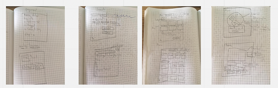
Low fidelity wireframing on Figma

High fidelity Prototyping
Home page

Product details

Contact page
Product page


THE FEATURES
- Precise selection possibilities

-
Price Range
-
Distance selection option
-
Condition selection
-
Type of trading
-
Design style and era with precise categories
- Photo carousel in every angle

Detailled photos with different angles enable to see all flaws and to see the product as clearly as it is possible to do


- Buy now / Bidd

The sites enables buy now options as well as bidding as research showed that price is a big factor in second hand purchases
The number of views is also something that shows how popular the object is and is a plus for users
Seller's review with last connection to help the users
Send message and place bid buttons

- Diverse payment options and delivery options
-
National and international shipment
-
Diverse Shipment options
-
Paypal
-
Classic payment methods
- Rating options and seller contact

-
Accurate and precise information about the seller
-
Possibility to get in touch with seller rapidly
-
Layout enables the users to have an overview on the reviews on one page
-
All those information help the user's to feel in safe hands
-
Secured process
Prototyping

Prototyping and testing
The different connections between the site's pages for the prototyping on Figma
UI Choices
-
Minimalistic design and colors
-
Simple but elegant font
-
Pale and neutral aesthetics that fit to the target audience
-
Keep it simple

Clean and geometrical Logo that remembers the world of design and minimalistic aesthetics


Simple font that fits the target and the products
Font Name: Maax
Grey minimalistic colors for titles, backgrounds and buttons
Usability testing and results
-
Three participants
-
Done at my home and assistant, one done via phone
Tasks:
-
Choosing one product that is available on the website
-
Contacting the seller and checking his ratings
-
Placing a bid for some products
-
Going for a chair in Scandinavian minimalism and going through the process
Results and takeaways:
-
Some technical issues with prototyping and getting to the right pages had to be fixed
-
Some buttons did not work correctly and had to be optimized
-
Fonts were partly too small
-
Overall the parcipants liked the aesthetics, the minimalism, the categorization
-
Excellent User Experience
Challenges and pitfalls
-
Two weeks timeframe for the project requires to focus on the main functions
-
Prioritization in terms of pages was key
-
Being a user oneself is a bias and it is important to listen to other users
-
User testing was a bit too little and could have been expanded